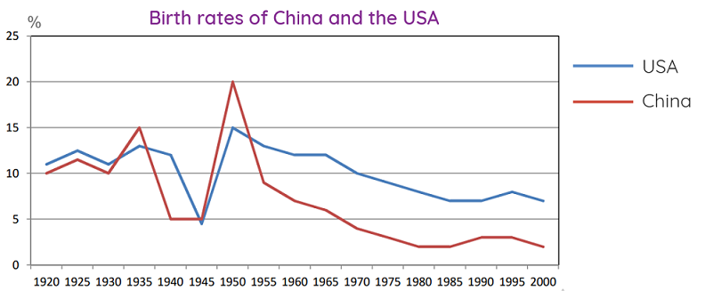
The graph below compares changes in the birth rates of China and the USA between 1920 and 2000.
Write a description (of about 150 words) of the trends in the graph.

Hãy nhập câu hỏi của bạn vào đây, nếu là tài khoản VIP, bạn sẽ được ưu tiên trả lời.


Poverty is no shame
My parents died in a traffic accident when I was ten years old, so I grew up with my grandmother who was too old and weak to work. I had to leave school and did odd jobs to earn a living: selling lottery kets, washing dishes and doing babysitting. When I was 15, my grandma encouraged me to attend evening classes, so I could improve my literacy and job prospects.
After lots of hardship and effort, I completed secondary education and passed a challenging exam to enter Medical University, which is the dream of many students. However, I could not pay the tuition fees and had to reject the offer. The door to a new life was closed before me. I was completely disappointed and saw only gloomy days ahead.Then something incredible happened: I was awarded a scholarship from The Thanh Nien for college students from poor families. This was really a turning point in my life because I could start my university studies and hope for a better future.
Six years of hard work at the university and of trying to live on a very tight budget came to an end at last. Now I am working as a doctor at a hospital, but I will never forget those difficult days. I am planning to set up and run a charitable organisation to help poor students, as a way to acknowledge other people for supporting me.
I've told my own story hoping to encourage other people me to overcome hard times. Don't let poverty defeat you and destroy your hopes for a better future. This is my motto.


Hai thanh niên đã đưa một loại virus vào hệ thống máy tính.
Trl: Hai thanh niên đưa virus vào hệ thống máy tính
K mk vs ạ

I think that you are an elephant. The title is not clear.
@Cỏ
#Forever
Em viết phần intro nha:
The chart above decsribes how the birth rates of 2 countries namely China, USA changed in 80 years which started from 1920
Answer:
The line graph compares the birth rates in China and the US and how these rates changed from 1920 to 2000.
Overall, there was a general decline in fertility of both nations throughout the time surveyed. However, the US’s birth rates almost was higher than that of China over the whole period.
American saw a significant fluctuation in the birth rates between 1920 to 1935, but it always remained over 10%. However, in the following decade, the fertility of the US decreased sharply to under 5 %. From 1945 to 1950, there was a rapidly increased in American’s birth rates, at 15%, reaching the highest point of it’s own during the whole period. From that on, the fertility of the US fell gradually to 7% in 2000.
During the 80-year period, the birth rates in China changed more significantly than in the US. It fell down to 5% in the year 1940, then reaching a peak of whole line graph in 1950, at 20%. Over the remainder of the period, China saw a sharply drop in the birth rates to only about 2% until 2000.